Artworks that make a difference
Between 2010 and 2014 the Raussmüller Collection published highlights of the collection under title Artworks that make a difference in their trimester programme for the Hallen für Neue Kunst, Schaffhausen. A large-format illustration of each work was followed by a short text – an introduction to the work as well as food for thought. To keep these informative texts accessible, you find them collected here:
- 2014/1: Jannis Kounellis, Senza titolo, 1975
- 2013/3: Robert Ryman and Urs Raussmüller, Advancing the Experience
- 2013/2: Mario Merz, Isola della frutta aspetta settembre, 1976/84
- 2013/1: Bruce Nauman, Flour Arrangements, 1966
- 2012/3: Sol LeWitt, Three part drawing, 1978
- 2012/2: Jannis Kounellis, Senza titolo, 1973
- 2012/1: Focus Robert Mangold
- 2011/3: Mario Merz, My home’s wind, 1978
- 2011/2: Robert Mangold, Four Color Frame Painting #7, 1984
- 2011/1: Jannis Kounellis, Senza titolo (metamorfosi), 1984
- 2010/3: Robert Mangold, Light Ellipse / Gray Frame, 1989
- 2010/2: Carl Andre, Cuts, 1967
- 2010/1: Bruce Nauman, Floating Room: Lit from Inside, 1972
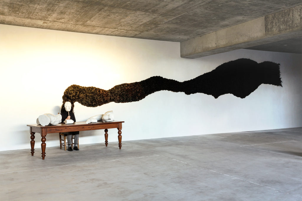
Jannis Kounellis, Senza titolo, 1975
© Jannis Kounellis / 2019, ProLitteris, Zurich. Photo: Fabio Fabbrini © Raussmüller.
“Frammenti di memoria” – fragments of memory – lie as plaster pieces that associate an antique sculpture, probably an Apollo, almost weightless on a long table. In an earlier action, a person sat here like an actor from antiquity and held Apollo’s mask in front of his face. The person figuratively supplants the Greek god, who is both the God of the arts as well as prophecy (see also Kounellis’ “Apollo” from 1973; Hallen program 2/2012). A ten-meter strand of authentic dark hair extends from the mask; it spreads onto the wall like a cloud of smoke and seems to symbolize the god’s power. In antiquity, the younglings consecrated their hair to the gods upon becoming men and being admitted to society. It was a request for protection in the future; one suspected that hair was a powerful source of vitality. In Kounellis’ work, the physical presence of the massive mane of hair releases a force that expands into the space as a fascinating and cryptic tension. It creates a maelstrom from which the observer’s fantasy can hardly escape.
The large installation is one of the Greek artist Jannis Kounellis’ major works. Created from the stock of his mythological vocabulary, forms and materials enter into a connection with ultimate intensity – a metaphorical unification of past and future. In Kounellis’ oeuvre, “Senza titolo” became a starting point for further compositions with multi-faceted levels of meaning. In the transition from fragments derived from antiquity into a vivid current of hair, it marks a highlight within a metamorphosis of his work; its traces reach all the way into Kounellis’ late period.
Robert Ryman und Urs Raussmüller: Advancing the Experience
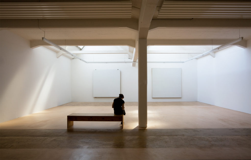
Photo: Fabio Fabbrini © Raussmüller.
It is truly amazing that a painting can actively create space—as is the case in Robert Ryman’s works. I would like to remind you of an old habit in painting: one used the frame to distinguish the image from the surrounding space in order to create an illusion of space within the frame. It is an extraordinary advancement in the history of painting that one can now effectively create space with the painting as such, and that this space is conveyed physically.
With this new understanding for a multi-dimensional effect of painting, the possibilities for painting as a phenomenon suddenly expand exponentially. By being able to create space, the step that painting can now take opens up completely new channels to effects and experiences. I mean “create space” in the sense of an active moment, not as a result of a form of representation. Directly emanating from within—the way it can be experienced in Robert Ryman’s paintings at the Hallen für Neue Kunst.
(Excerpt from an interview with Urs Raussmüller in “Robert Ryman and Urs Raussmüller: Advancing the Experience Hallen für Neue Kunst, Schaffhausen, 2010)
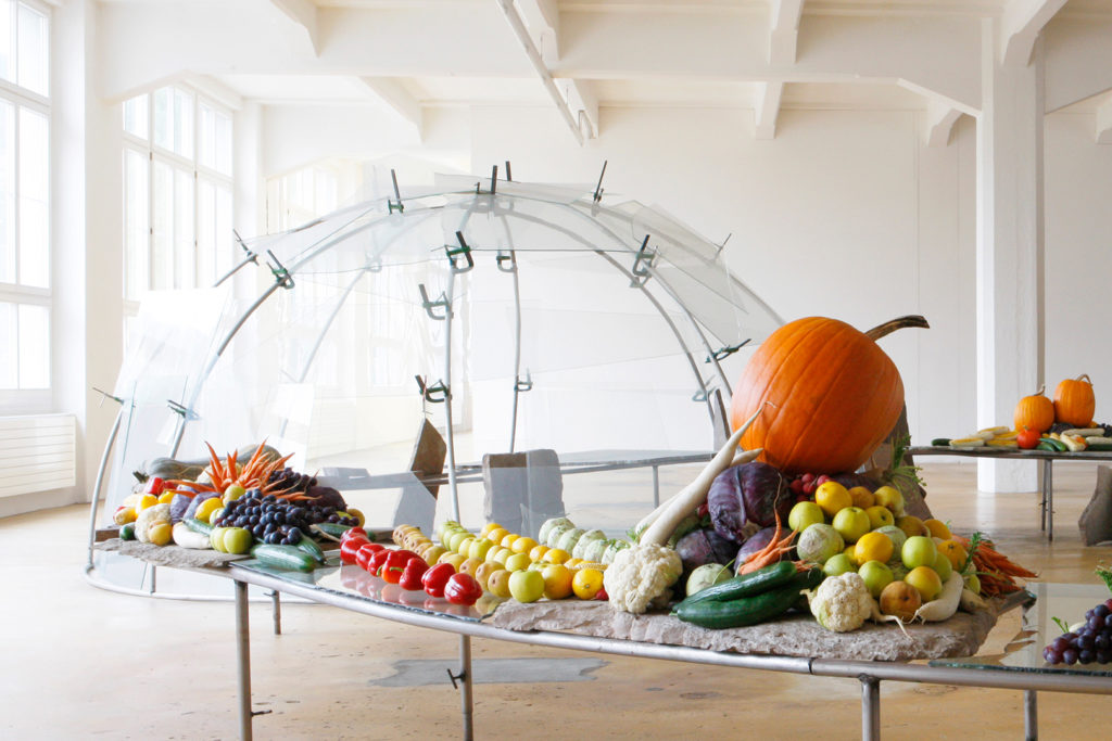
Mario Merz, Isola della frutta aspetta settembre, 1976/1984
© Mario Merz / 2019, ProLitteris, Zurich. Photo: Fabio Fabbrini © Raussmüller.
In the Hallen für Neue Kunst, Mario Merz connected a large glass igloo to a spacious table and auspiciously called this major work “The Island of Fruit Waits for September”. Merz didn’t tell us which September he was referring to. He chose the fall of 1987 as the first time to reward this island for having awaited the ripening and harvest. In September of 2008, the “Isola” was once again brought to life. For a short period of three weeks, the stone slabs and glass plates of the curved table are covered by copious amounts of fruit of all kinds. The diversity of its color and appearance as well as the advancing evidence of its perishable state offer us a concrete image of the passing of time and the organic process of creation and decay that all life is subject to. After this sensual demonstration, the island returns to a different temporal state – to the long phase of crystalline endurance. The poetic title is then the sole reference to nature’s cyclic processes.
Find the richly illustrated publication “Mario Merz: Isola della frutta” (2009) in our bookshop.
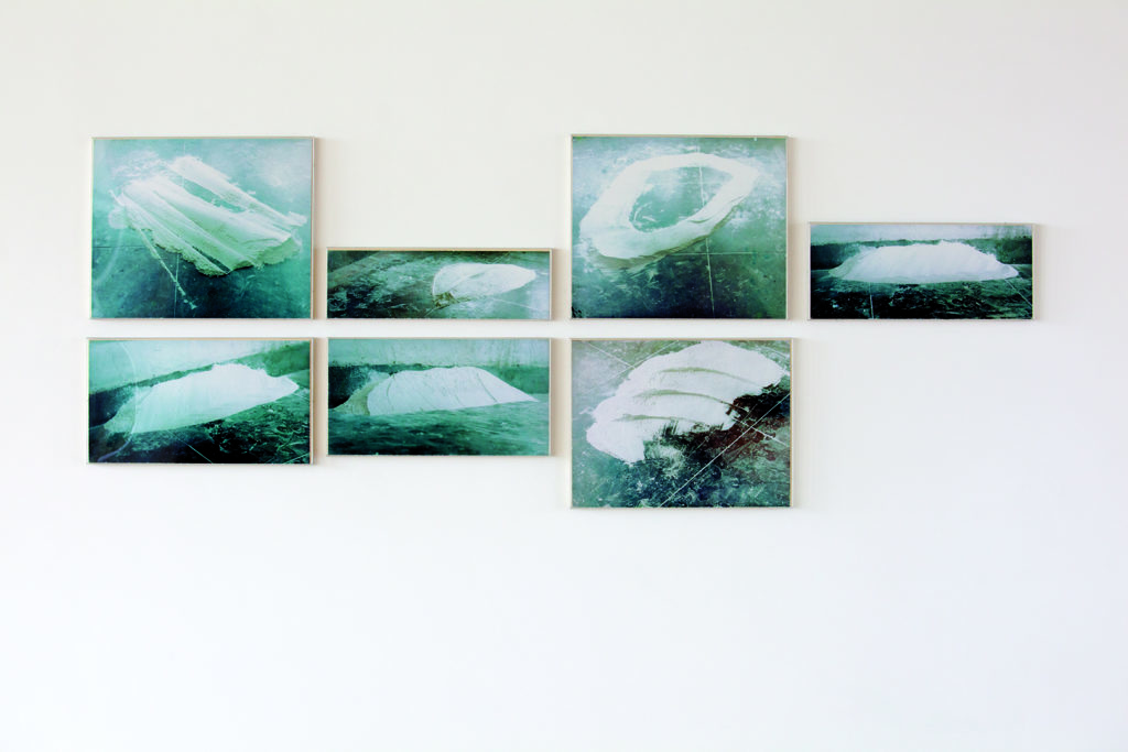
Bruce Nauman, Flour Arrangements, 1966
© Bruce Nauman / 2018, ProLitteris, Zurich.
Attracted by the amorphous white shapes on a greenish background, the viewers approach the seven photographs to discover what is being represented here. Many see islands in the ocean; others see modern architecture. In any case, they seem to be photos taken from a certain distance – probably, one could assume, aerial shots.
However, even looking at them from up close doesn’t serve to alleviate the irritation. So you search for an explanation by asking for the title. The answer doesn’t help everyone, because you really don’t see flower arrangements. Until the moment of insight occurs: it’s not about flowers, but rather flour. Nauman constantly rearranged the white material on the floor of his vacated studio into new forms and then photographed them. The shapes on the photos – much smaller than you expect at first – are thus the result of a sculptural act. But this isn’t the actual work yet; the seven selected photos aren’t the work either. The actual work is the all-encompassing process: from the premeditated arrangement of the flour to the photographic recording of the shapes and the connection of the images with the misleading title… on up to the process of insight in the viewer’s consciousness.
In the development of art, the “Flour Arrangement” is a milestone, and it is exemplary for Nauman’s great influence on younger artists. For the first time, and without a precursor, he introduced photography as a complementary artistic medium and, with surprisingly simple means, created a double disassociation. By photographing his flour arrangements, he reduced the recognizability of its materiality and dimensions. With the play on words in the title, he also made it harder to understand. Nauman thus creates a challenge for perceiving the work that almost forces the viewer to relieve the confusion. Hardly another work exists in which materials and media are used in such a simultaneously succinct and accurate way to create an irritation that turns the viewers into participants in an artist-defined process. – This is the only existing edition of these seven color photos.
Read the extensive text “Bruce Nauman: Flour Arrangements, 1966” (2017) by Christel Sauer on our platform.
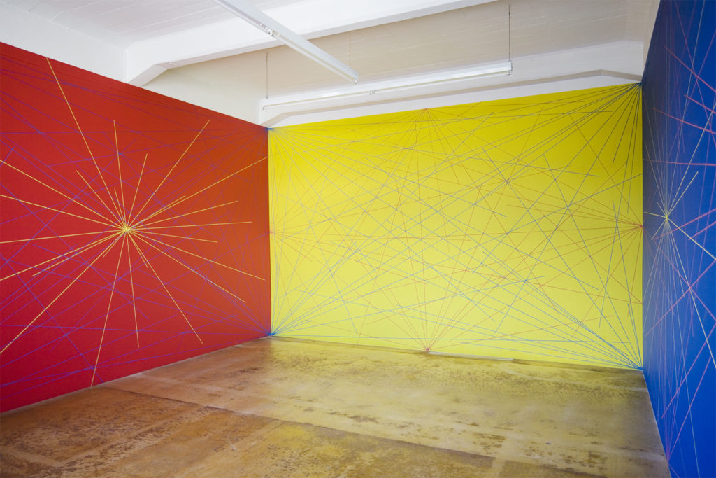
Sol LeWitt, Wall Drawing 308, 1978
© Sol LeWitt / 2019, ProLitteris, Zurich. Photo: Fabio Fabbrini © Raussmüller.
Three part drawing: A six-inch (15 cm) grid covering the walls.
1st wall: on a red wall, blue lines from each corner to points on the grid,
yellow lines from the center to points on the grid
2nd wall: on a yellow wall, blue lines from each corner to points on the grid,
red lines from the midpoint of each side to points on the grid
3rd wall: on a blue wall, red lines from the midpoint of each side to points on the
grid, yellow lines from the center to points on the grid
(from each point 12 lines)
The number of lines and their length are determined by the draftsman, but each wall has an equal number of lines
1978 first installation: Museum of Modern Art, New York
1983 Hallen für Neue Kunst, Schaffhausen, drawn by Anthony Sansotta, Markus Ammann, Bettina Roost
Theoretically you already know exactly what you will see when you read the title of LeWitt’s work. The title is such a precise description of the three-part wall drawing that it simultaneously serves as directions for its realization. However, when you stand directly in front of the work – even more, if you enter it – the physical presence of the color space suspends your technical interest in the principles of its construction. You are surrounded by fireworks that directly influence your senses. You feel yourself to be in the midst of a field of action whose dynamics are not to be surmised from the pure description of the red/yellow/blue walls.
Given art’s development, this aspect has special meaning. Sol LeWitt, “father of conceptual art”, published influential texts at the end of the 1960s in which he called the idea of an artwork its most important aspect and its execution “a perfunctory affair”. He thus caused a great opening in the appearance of art, which to an extent also led to its theorization. But it is precisely this vital work by LeWitt that demonstrates how very necessary the realization of the idea is in order to experience its quality. New is that the realization can occur without the artist’s personal involvement and can be assigned to others on the basis of his clearly formulated concept. The realization of the artwork becomes a collective process that remains alive for generations.
Find the publication “Sol LeWitt: Wall Drawing 308” (2013) with an extensive text by Christel Sauer in our webshop – or read another article on our platform to learn more about the LeWitt installation in the Hallen für Neue Kunst, Schaffhausen, which remained in place for over three decades (1983 – 2014).
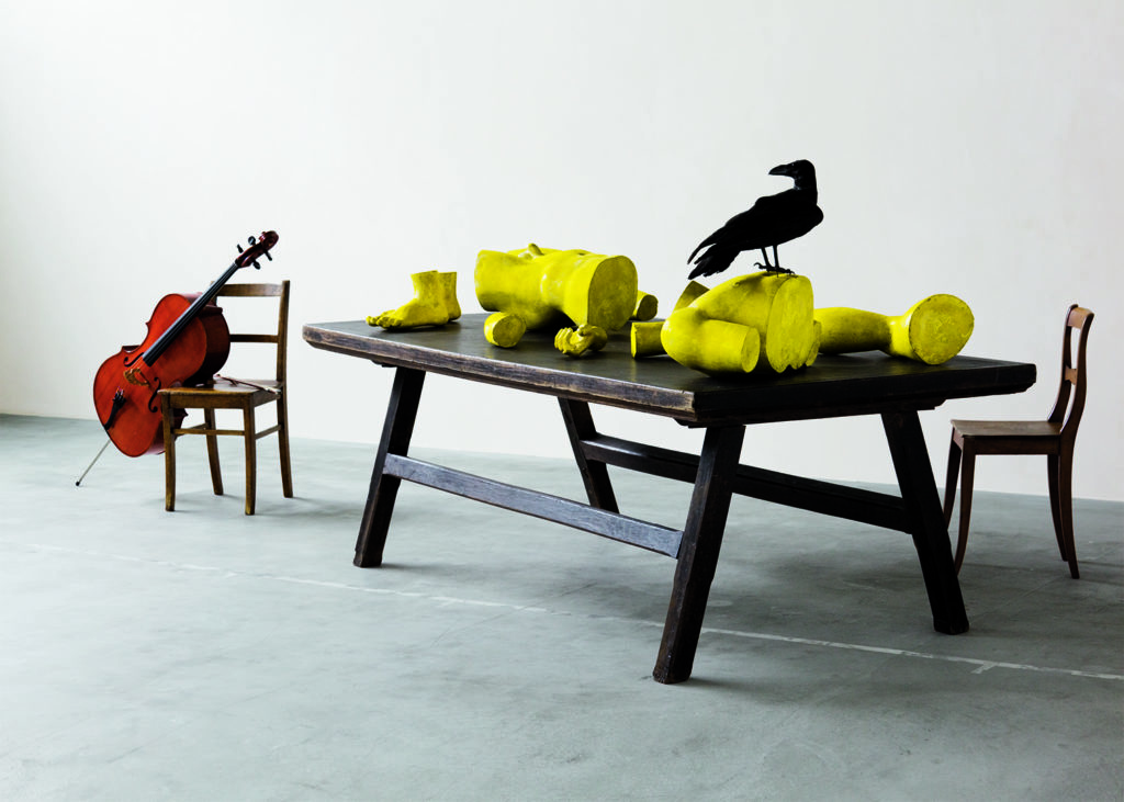
Jannis Kounellis, Senza titolo, 1973
© Jannis Kounellis / 2019, ProLitteris, Zurich. Photo: Fabio Fabbrini, © Raussmüller.
In 1973, during an era of protest against hypocritical values and reactionary systems, Kounellis placed a suggestive “still life” with fragments of a classical statue on display. Conceptual art was booming; many artists sought to liberate themselves from traditions by “escaping images” – in order to lead to a renewal of art and society.
Kounellis also sees himself as a rebel – but not as an iconoclast. Quite the contrary. As critical as he is poetic, he creates real, new images from fragments of cultural history. His appeal to society is not a break with the past; instead, he points to the deep truths buried in myths – without being conscious of them, collective progress isn’t conceivable. For him, perceiving history is a key to recognizing the present and shaping the future.
This untitled work, the so-called “Apollo”, is one of Kounellis’ main works – and beyond that, the embodyment of an idea of art that leads to insights. The “image” was originally tied to a performance: the artist sat behind the fragments of the Greek statue and held the mask of “Apollo’s” head in front of his face while a flutist played a Mozart melody. A short time later, Kounellis gave the work a different touch by coloring the plaster a sun-hued yellow and, under the influence of Brecht, having Weill played on a cello.
The artist appears here as a creator. He participates in shaping the world with his creative abilities. In front of him lies – metaphorically – a cultural heritage that must be revived. At his side is a visionary bird: an attribute of the God of light and prophecy, Apollo.
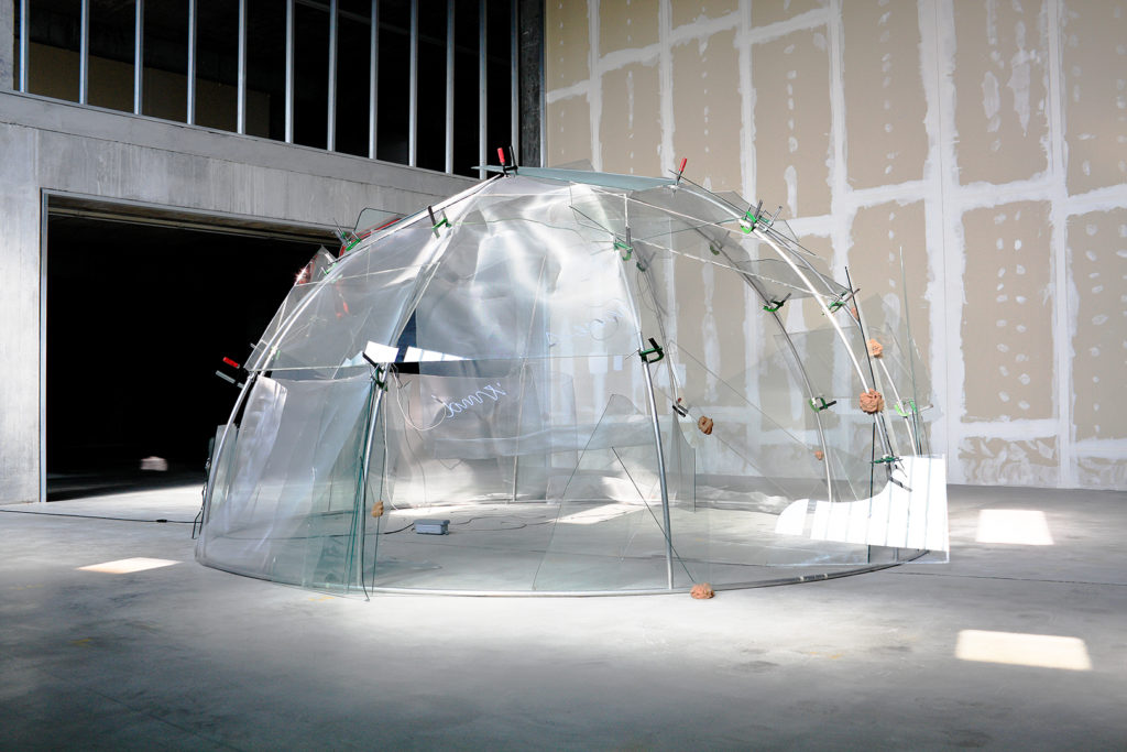
Mario Merz, My home’s wind, 1978
© Mario Merz / 2019, ProLitteris, Zurich. Photo: Fabio Fabbrini © Raussmüller.
Mario Merz built houses repeatedly – often in the organic form of an igloo or yurt. He usually used materials without obvious intrinsic value: found objects, stones, deadwood and glass. He layered the pieces on top of one another like a nomad, without fixating them, so that the houses could be taken apart again and re-erected at a new site. His igloos have shaped the image of Merz’s art all over the world. However, the variability and subtlety Merz employed in this elementary form, and how diverse the meanings are that he gave them, can only be discovered in the wealth of the many versions he created.
Merz was an intelligent and sensitive man who spent his life trying to confront social superficiality with contents and fantasy. His igloo titled “My home’s wind” is a masterpiece of poetic imagery and has all the characteristics of a magical situation. The entire construct has a lightness that bor- ders on the ephemeral and transports an atmosphere that lies between liberation and melancholy. The principle of openness has found its metaphor here, and the wind’s movement attains a sensual quality. I move with the wind that originates in the past and carries me into the future. I sense the spiritual freedom that it conveys, and I experience the clarity as an approach to life.
It is precisely this physical intensity that gives Mario Merz’s work a special presence. A substance is found here that, like a puzzle, doesn’t immediately provide the key to understanding. This increases the fascination for a work such as “My home’s wind”. Merz creates a location in time for people, without anchoring them there. The entrance to this location can also be hovering above the floor – like the red car door in this filigree igloo.
The publication “My home’s wind” (2011) is also part of our Mario Merz Series.
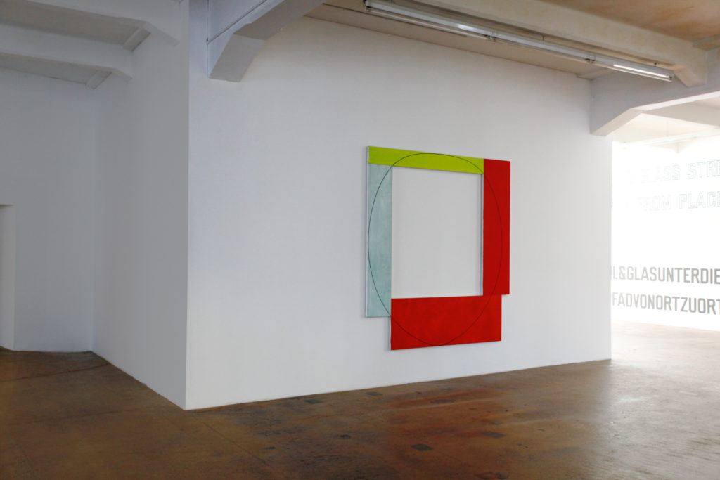
Robert Mangold, Four Color Frame Painting #7 (yellow-green, red, red-orange, light blue), 1984
© Robert Mangold / 2019, ProLitteris, Zurich. Photo: Fabio Fabbrini, © Raussmüller.
Our idea of a painting is usually based on tradition, and as a rule a traditional painting is constructed so that the most important part is at its center. This is where the essential events occur, the representation is highlighted and the observer’s eye is directed.
Nothing of the above can be found in a Mangold work like this one. One can’t even speak of a picture, since nothing is represented. And above all: the center is open and shows nothing other than a white wall. But we still have a painting of great intensity and radiance in front of us. It has so much energy that its surface reaches out to us in a physical way. The entire wall reacts dynamically and leaves no doubt that it is fully integrated into the effect. The four color fields of the “Four Color Frame”, mounted along their edges, create a tension in connection with the space that transmits itself onto the observer. This is where the event takes place – outside of the painting, but still caused by its properties and quality.
What did Mangold do? He painted each of four rectangles in different widths with a unique color and used rather unusual combinations in hues. The parts are screwed together in the rear to form a square “frame”. They are joined together in the front with an oval graphite line that crosses through all surfaces and is applied in layers the same way color is. Despite its raw character, the whole is of utmost precision; the stroke of the line, drawn by hand, deserves close observation. In fact, this work’s concept as well as realization is a challenge to perception – the expression and trigger for a process that charges intelligence with emotion.
See more Mangold installations in the Raussmüller Hallen, Basel and the Hallen für Neue Kunst, Schaffhausen in a series of photographs on this platform. We have also published an insightful text by Christel Sauer on this work in our publication Three Works by Robert Mangold (2011).
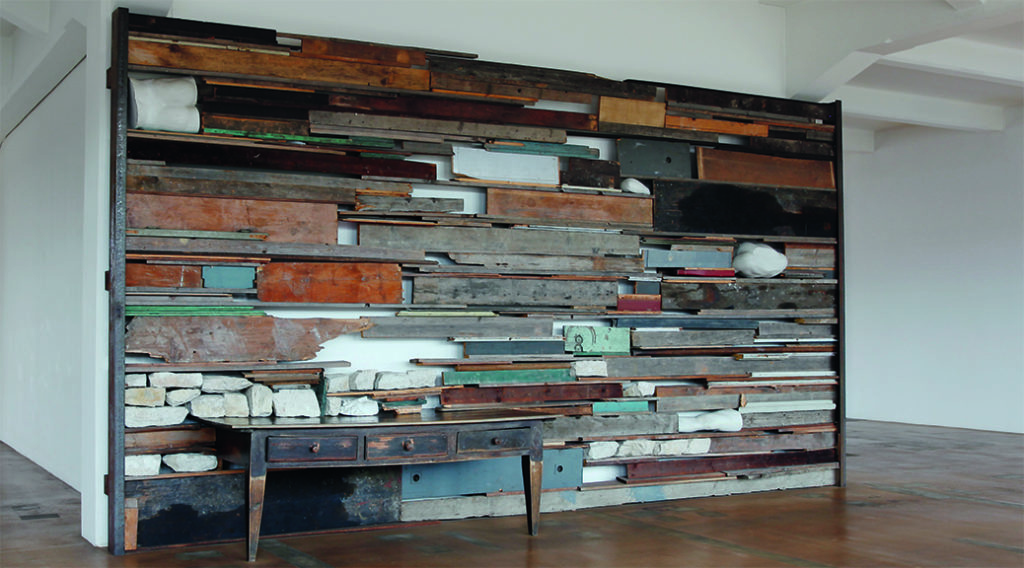
Jannis Kounellis, Senza titolo (metamorfosi), 1984
© Jannis Kounellis / 2019, ProLitteris, Zurich. Photo: Fabio Fabbrini, © Raussmüller.
This work, created especially for the newly founded Hallen für Neue Kunst, literally visualizes history as stratification. Kounellis had built a wall with stones and boards from the ruins of a broken-down Schaffhausen house; it covers the entire wall that it stands in front of. Each board was selected for ist uniqueness and highlighted by the traces of use it encountered. But not only Schaffhausen found a place in this work. As in Rome, where Kounellis lived, fragments appear in the wall like spolias: pieces of a cast of a Greek statue that is seen to be Apollo. The god of the muses’ mask lays on the table that helpes shoulder the layers; it is as though it were representing the creative artist.
Motivated by the transformation of the Schaffhausen textile factory into an art museum, Kounellis had tied the location and its history to a larger subject: the metamorphosis of one form into another. It is as though he is leading us onto a stage where a small section of world history could be experienced. The special thing: the image Kounellis presents to us is not fictional. Every part of it is what it is; however, the artist gave a poetic soul to the reality that we are faced with here. Change took on a shape in his work, and in the physical concentration we are confronted by the conviction that only consciousness of historical relationships puts us in a position to determine our own point of view today.
„Senza titolo (metamorfosi)” was part of a larger situation within the Hallen für Neue Kunst in which Kounellis, by selecting and placing different works, had bonded together the specific with the fundamental to form a general statement.
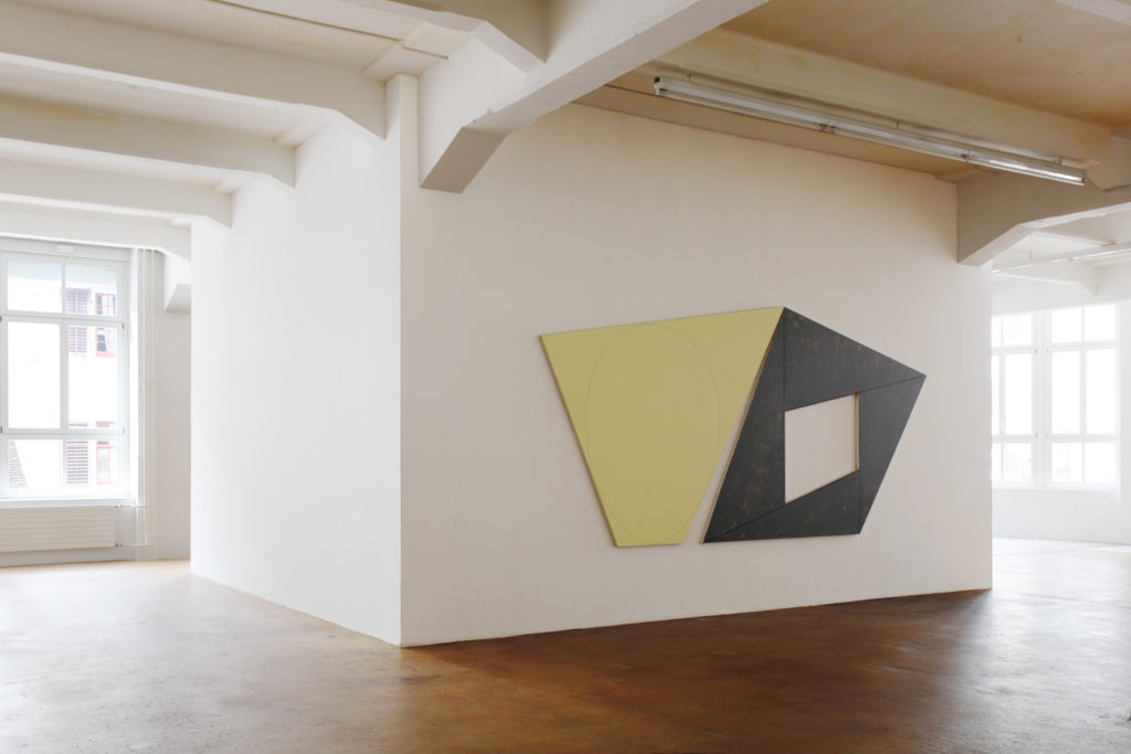
Robert Mangold, Light Ellipse / Gray Frame, 1989
© Robert Mangold / 2018, ProLitteris, Zurich. Photo: Fabio Fabbrini, © Raussmüller.
Robert Mangold is one of the great reformers of painting. A work such as “Light Ellipse / Gray Frame” has never existed previously. The painting extends onto the wall far beyond its dissimilar edges. In fact, the wall is a part of the work and is directly integrated in its construction. Liberated from the rectangular frame standard, the painting opens up into the space.
“Light Ellipse / Gray Frame” is made up of two parts, both of which are convincing paintings in their own right. The title of the work describes their unique character. Despite all differences in appearance, both parts balance each other completely. They only meet at their highest point – but still create a unified whole.
Mangold gives elements of painting a totally new effect. The form creates the work’s extension and connects it to the wall. The color – in its application and choice of hue – is the material that physically brings the painting to the fore, to the observer. The line ties the whole together and prevents the illusion of a “pictorial space”.
Robert Mangold’s paintings always create a generous unity. All elements appear with equal value and without demonstrative effects. They seem to join together as a matter of course and simultaneously succeed in creating tension. The “events” within the painting and beyond its borders take place in the precise collaboration among its parts.
The viewers experience “Light Ellipse / Gray Frame” as a surprising phenomenon. The physical presence of the irregular color planes makes it difficult to take on a position of distance. The artwork emanates an energy that contradicts its calm radiance. The complexity behind the “simple” surface leads observers to marvel in astonishment.
See more Mangold installations in Schaffhausen and Basel in a series of photographs on our online platform Raussmüller Insights. We have also published an insightful text by Christel Sauer on this work in our publication Three Works by Robert Mangold (2011).
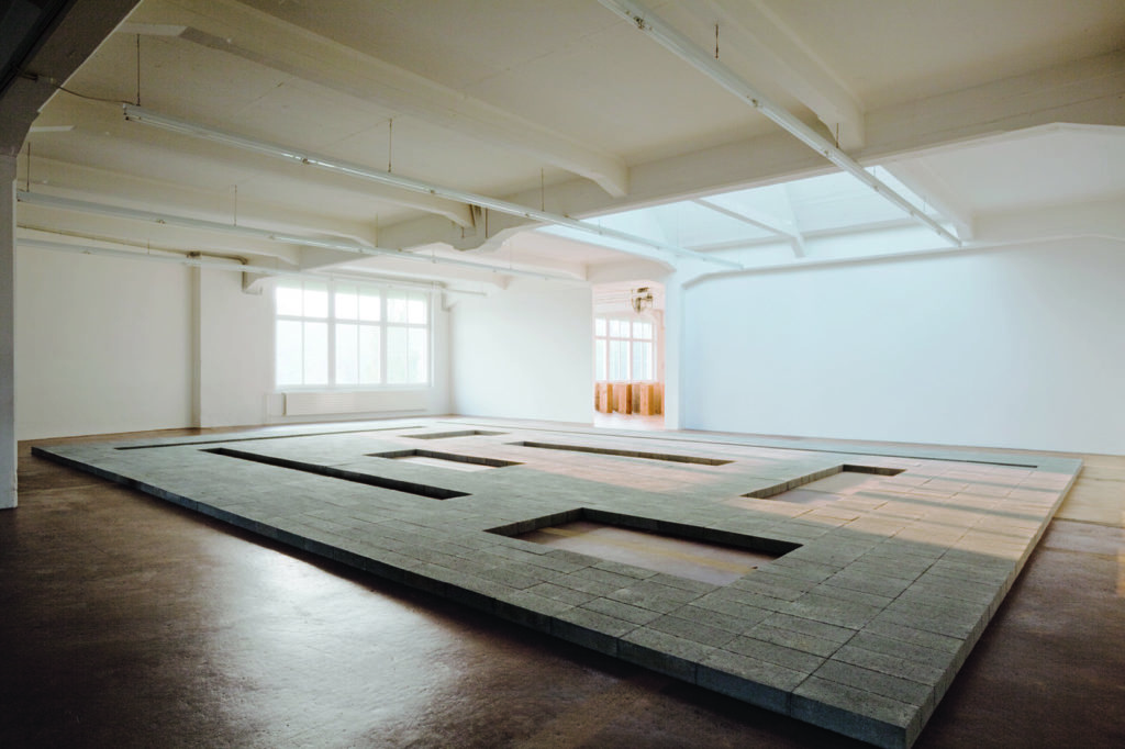
Carl Andre, Cuts, 1967
© Carl Andre / 2019, ProLitteris, Zurich. Photo: Fabio Fabbrini, © Raussmüller
“Cuts” is one of the essential works of New Art. Never before had an artist created a sculpture that had applied fundamental democratic principles to such an extent and had such a corresponding effect on the observer. There are no hierarchical aspects in this powerful work. The elements it is made up of – standardized concrete capstones – are all the same, have the same value and create the whole in unison. They occupy the same level as the observer and, given their dimension and horizontal extension, demand the observer’s active approach. Every shift in viewpoint opens up new perspectives for the recipient onto multiple facets of this apparently homogenous whole.
“Cuts” is made up of a serial placement of 1232 rectangular stones that combine to form a compact field with eight “cuts”. The surface area of each cut is identical; their form aries between a line and an almost square rectangle. In each case 30 stones were omitted; however, the openings’ various constellations make it difficult to directly encrypt the principle.
As a central work of Minimal Art, illustrations of “Cuts” can be found in many publications. But the work could not be experienced for a long time. After the legendary exhibition in 1967 at the Dwan Gallery, Los Angeles, the stones then served their function as construction material. Urs Raussmüller purchased the concept from the artist, had the 4 x 8 x 16 inch concrete capstones imported from the USA to Schaffhausen and in May 2000 constructed “Cuts” (with a total weight of more than 16 tons) in the Hallen für Neue Kunst, where it could be experienced until 2014.
Find out more about this stunning artwork in our monograph “Cuts” (2011).
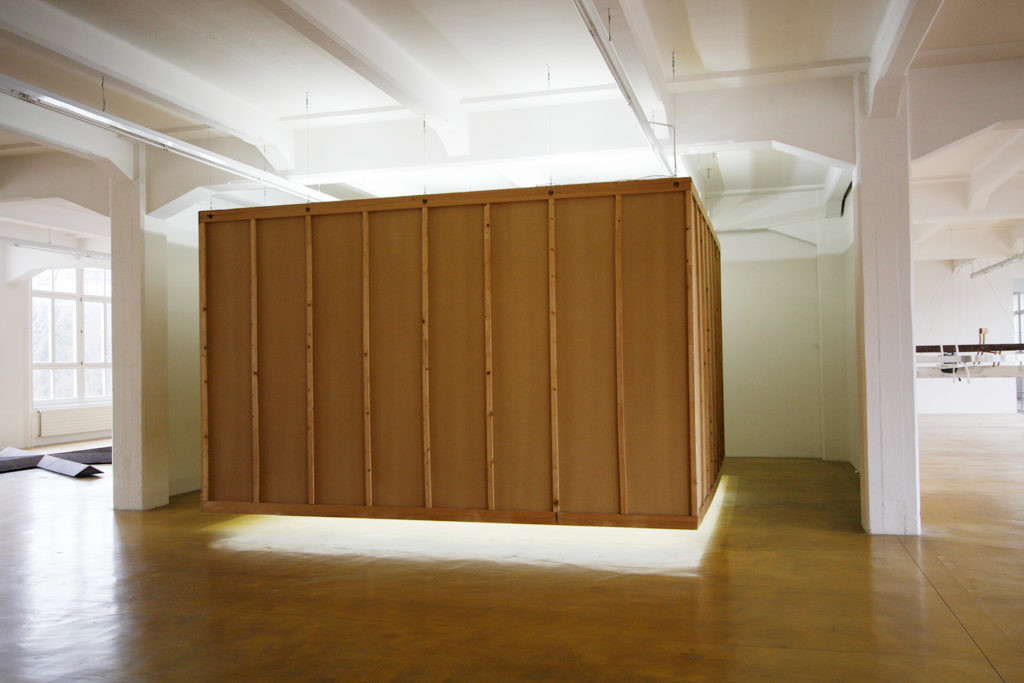
Bruce Nauman, Floating Room: Lit from Inside, 1972
© Bruce Nauman / 2019, ProLitteris, Zurich. Photo: Fabio Fabbrini, © Raussmüller.
From the outside, the Floating Room seems to be a hanging cube – until the visitior discovers the entrance. When he passes the treshold, everything changes. He finds himself in an average sized room, painted uniformly in white and brightly lit, lacking a single point where he could fixate his gaze. Even the door closes firmly, without a doorknob. And suddenly the room begins to flicker and its contours begin to dissolve. The walls aren’t solid surfaces anymore; one’s own position begins to waver. The hanging room suggests transistions between the walls and the floor where none exist, and the visitor (who has long since become an affected party) begins to increasingly feel as though he is being deprived of security in his standpoint.
There is hardly a second work that disempowers the art observer’s position so succinctly and precisely like the “Floating Room”. We are dealing with a fact that suspends the division between art and world, art and daily life as well as art and the observer. The whole is the phenomenon, and the museum visitor is part of it. In the context of art’s development, Nauman’s “Floating Room” embodies a fundamental step towards a new art.
Read the extensive text “Floating Room: Lit from Inside, 1972” (2017) by Christel Sauer on our platform.
17.10.2019
